
Sockeye Brewing has Idaho in their DNA — they’re not just one of the state’s oldest breweries, they’re also one of the most recognized and awarded. So, with 2021 as their 25th anniversary, the brewery was ready for a brand refresh. And our beer-loving designers were more than willing to jump in and help.
Sockeye’s brand has always been no nonsense, just like their beer. In fact, they’ve had the same master brewer since their founding, and their (and his) suspicion of frills or trends hasn’t wavered. Even so, it was easy to see that it was high time for a brand refresh to ensure Sockeye maintained its growth for the next 25 years.
Evolving the brand
We wanted to honor Sockeye Brewing‘s history and Idaho roots, while helping shift the brand to a more inviting, contemporary look, without confusing customers. In the spirit of this, we kept many of their core colors and no-nonsense authenticity in our designs.
So, our process for Sockeye for the brand refresh was very hands-on. We explored a variety of directions with their team, sharing hand-drawn illustrations, color treatments and digital revisions. In the end, we gave Sockeye an entire brand system that updated their iconic fish and logo. We simplified the logo to a wordmark and added the fish as a separate brand element.
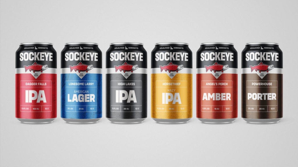
The new system is easier to use and includes a variety of elements that are much more flexible, especially in digital mediums like websites. The brand is now made up of a collection of elements that can be adapted with ease, in place of a single logo. We’re using these elements on boxes, cans and tap handles.
Honoring past and present
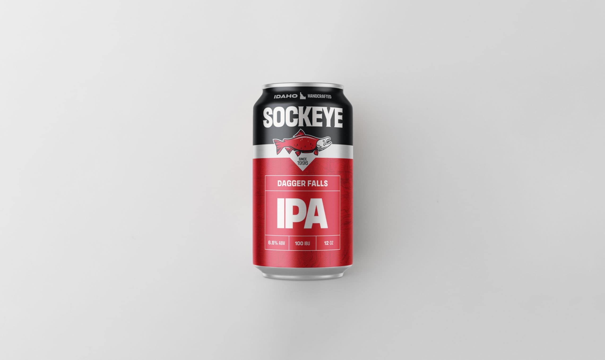
For the can itself, we created artwork specifically intended to reproduce at a high-quality in its final form. We kept excess detail to a minimum while developing a more realistic, stylized sockeye salmon. We wanted to ensure all elements reproduced beautifully on the cans.
The cans also feature a new element — a topographic map — that pays homage to the beer names. Many of Sockeye’s beers are named after rapids, mountain peaks, animals and lakes. Their flagship beer, Dagger Falls, gets its moniker from a Class V rapid on the Middle Fork Salmon. Angel’s Perch Amber is named after a peak in the Pioneer Mountains. Lonesome Larry gets its name from a fish who became famous in 1992. Larry swam 900 miles — climbing 6,500 feet in elevation — back to his native spawning grounds at Redfish Lake only to find there were no other sockeye salmon there.

Adding a dominant color
Color is one of the most important brand elements. Some colors we changed, some we didn’t. Mostly we wanted to incorporate modern colors that would stand out on the shelf. Black now plays a large role in the brand. We added this color for a few key reasons:
- It makes their cans, regardless of color/SKU, look more unified on the shelf
- It adds contrast and makes the surrounding colors pop
- Fuses a toughness to the overall look
- Helps frame the brand name
Building the brand look
Our team didn’t just focus on refreshing the fish or design some kickass cans. This was a full brand refresh including new
- wordmark
- fish logo
- typographic system
- topographic location inspired can design across all offerings
- Packaging of 12 & 24 pack boxes
- Variety mix box packaging
We had a blast working with Sockeye and it was our pleasure to be part of the changes surrounding their 25th anniversary. There’s nothing we’d rather do than raise a can of Dagger Falls encased in its sleek new design.
Want to see more? Check out our full brand refresh work with Sockeye Brewing here.