
When Bluefin, a leader in the data and payment security industry, came to us for help refreshing their brand identity, language and lead-gen website, we were eager to get started. For one, it was an opportunity to redesign a global tech brand. But it was also a chance to rethink how a leading company expresses itself to a global audience. Simply put, Bluefin’s service and offerings are complex, so it was important for a variety of customers to be able to understand their UVPs and distinguish between products. Their logo had history, but it was also dated and confusing. And their website was heavily trafficked, but difficult to navigate and capture leads.
Brand messaging
Before we could tackle a website redesign, or even logo design, we needed to better understand exactly what Bluefin provides to their customers and what sets them apart from the competition. It quickly became clear that they’re an industry leader for a reason. Brilliant leadership and innovative thinking have propelled them to their industry darling position, and continuous product evolution has kept them there. They’re not thinking just about the data and payment security needs of today, because they already have that covered with a robust product line to address current issues. Bluefin is looking ahead to the data and payment security challenges of tomorrow, and making sure they’re solving problems before they even arise.
This is all well and good, unless the information about who they are and what they offer is so confusing that the points are lost. Enter DW. Refining Bluefin’s messaging to be more digestible and streamlined was of the utmost importance.
We distilled it all down to a few key points:
- Why Bluefin?
- How Bluefin works
- UVPs
- Brand voice & tone
- Brand archetype
- Customer journey
With a refined messaging platform in their toolkit, Bluefin now knows how to describe their offerings and highlight their UVPs in terminology the rest of us can understand.
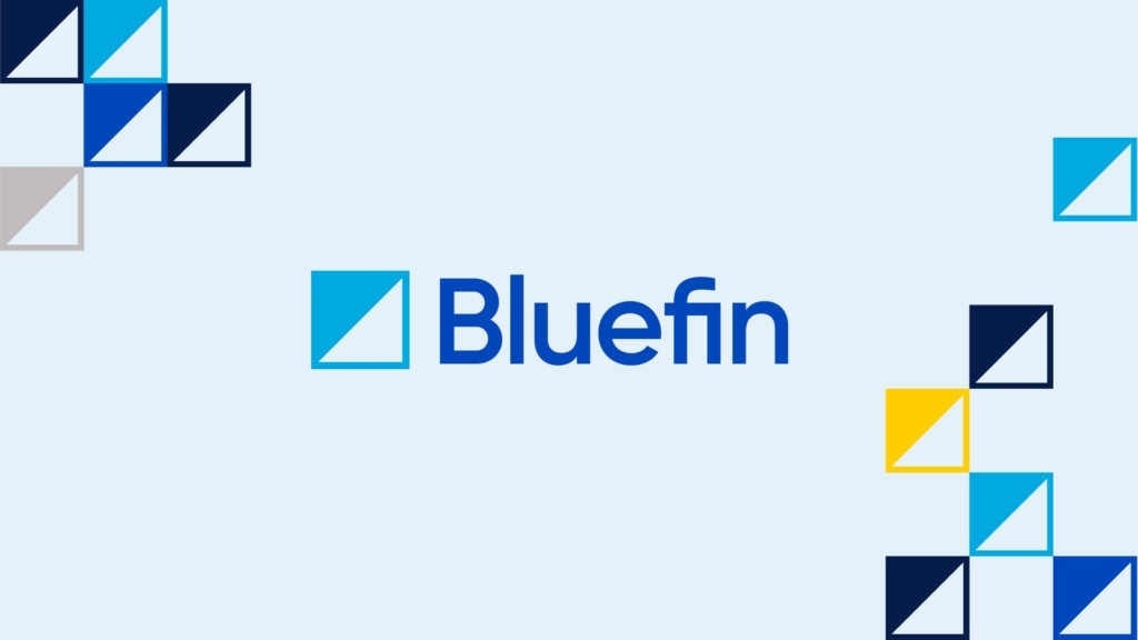
Logo design
Thanks to the messaging platform, DW had a clear understanding of what we wanted Bluefin’s new logo to represent. First, it had to pay homage to the original fin logo that had supported the brand up to this point. But it also needed to feel more applicable to their tech-forward products and sophisticated partnerships. Finally, we wanted to ensure it felt like a contemporary, modern mark to carry the brand forward.
DW provided several concepts to choose from, and Bluefin’s selection underscores an age-old truth: sometimes simple is best. In this case, a clean, refined logo achieved all of our goals, while also offering opportunity for patterns and textures that would elevate not only the website’s design but various other brand materials as well, from presentation templates to sell sheets, business cards to signage.
Website architecture & design
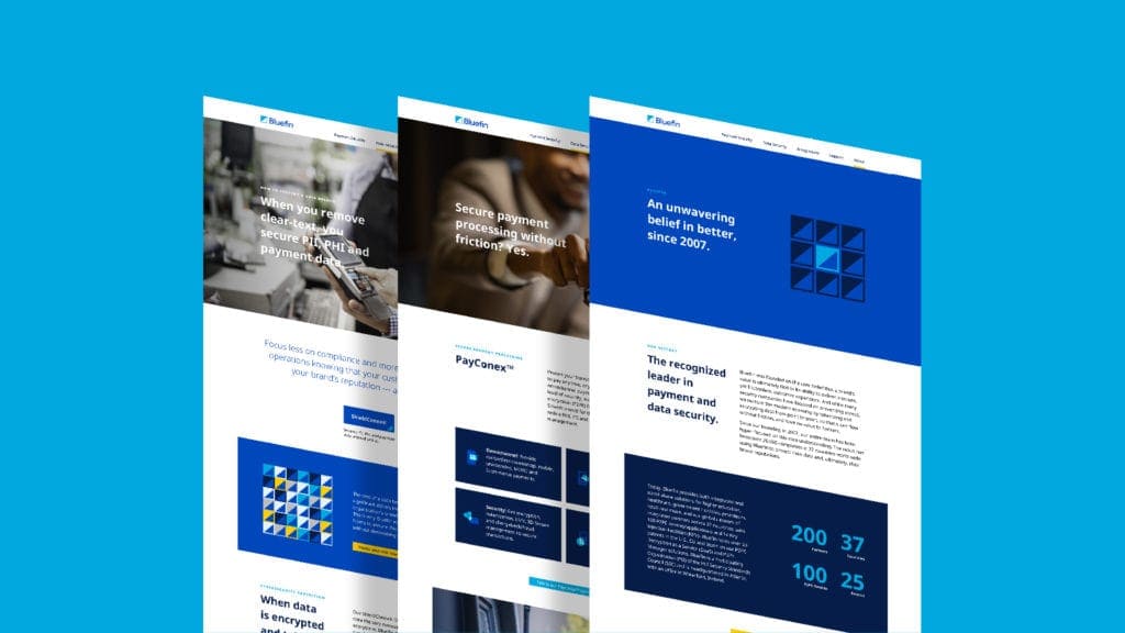
When DW collaborated with the Bluefin team to conceptualize a refreshed website, the site architecture was immediately identified as the top priority. A sitemap is always a critical aspect of website design, but it was perhaps more important that we land on the right structure for Bluefin’s website than with any clients who came before. That’s because we knew we’d need to carry over information from several dozen existing pages, but clarify the content and significantly decrease the page count while improving the user experience and customer journey to raise demo conversions.
Based on heatmaps and traffic metrics for their existing website coupled with the refined messaging platform, DW had the data in hand to identify the key navigation menu items and the information that should fall within them. Upon finalization of the site architecture, we shifted gears and dove into design.
The DW team approached Bluefin’s website design with a few key goals in mind:
- Clear information hierarchy
- Distinct calls to action (CTAs)
- Introducing lifestyle photography to humanize the brand
- Clean navigation in both the top navigation and footer menus
- Incorporating the new logo pattern in engaging ways
DW provided a few concepts for consideration, and the Bluefin team eagerly made their selection. When you know, you know. We took the chosen concept and applied it to the various pages on the site, ensuring that each page would offer something new to visitors while still having a cohesive look and feel across them all.
Upon design approval, the DW team provided consultation to Bluefin’s development team while they tackled programming. While we love to manage a project all the way through programming and development, we’re also happy to collaborate with client’s in-house teams when that is their preference!
Launch!
We’re excited to watch Bluefin’s continued success and are proud to have been a part of their evolution into the new, modern brand they are today.
Want to see more?
For more examples of our work in the finance and banking industry, check out our work with Washington Trust Bank, that catapulted tremendous growth throughout the Pacific Northwest.