Live a life worth toasting.
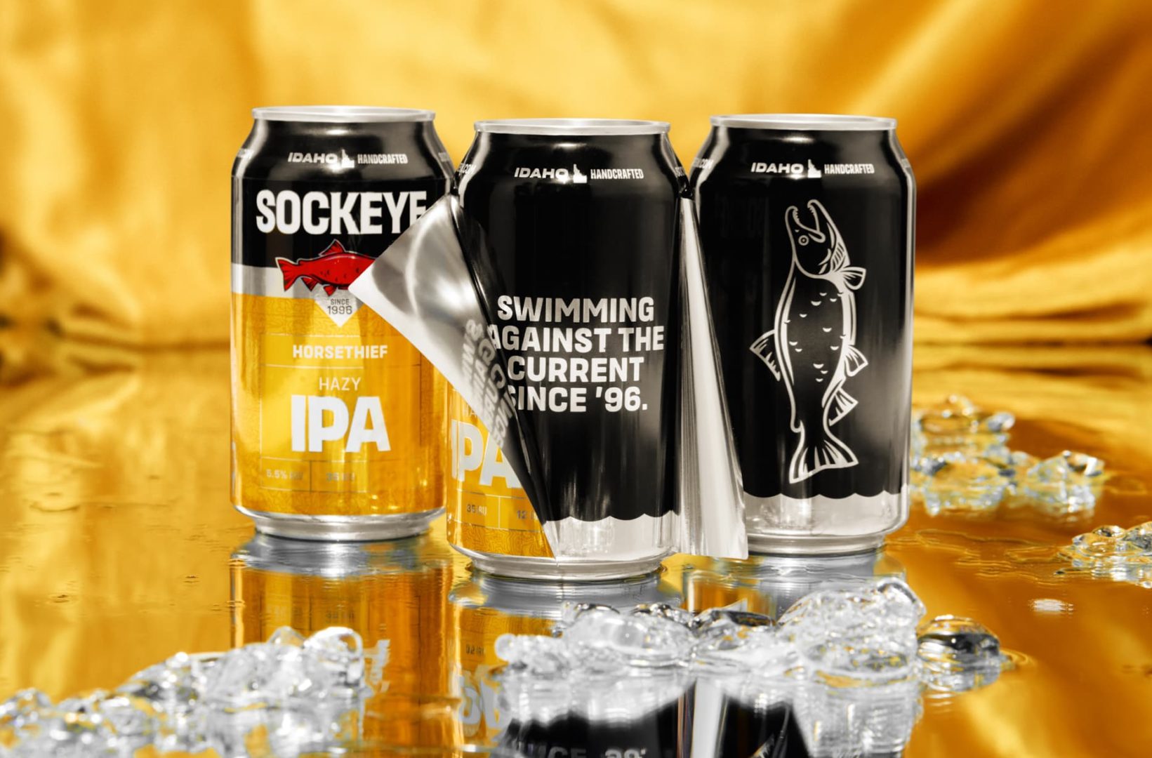
When Idaho’s most iconic beer brand teams up with an office full of beer and outdoor enthusiasts, good things are likely to happen. In this case, Sockeye Brewing approached DW with a complete brand redesign project on the eve of their 25th anniversary, and our response was a resounding, “Hell yeah, let’s do this.”
But our excitement for this project was also tempered with a concern for not wanting to screw up an established and beloved brand. Get it wrong, and we’d have Idahoans throwing beer cans, oars, fly rods and hiking boots at us. Get it right, and we’d stay true to the authentic, no-nonsense spirit of Sockeye, but also infuse a more confident and simplified design system that would help every can and box stand tall on increasingly crowded shelves. Simply put, we needed to honor Sockeye’s rich history while positioning the brand for success during the next 25 years.
Given the market’s and Sockeye’s response, we succeeded (whew!). The new brand system is built around a strong typographic and information hierarchy, so brews, ABVs and insights are easier to read. It’s a design system that’s both clean and modern, but also leverages the familiar color system and Idaho ethos we all recognize and love (notice the legendary topo locations?). The designs are new, but also familiar and, yes, something die-hard Sockeye fans are proud to raise a beer to.


